Need help improving the look and feel of your website? Here are 12 website design tips that will help you to provide a better experience for your users and bring them closer to taking the desired action on your site. Let’s dig in.
Your logo is integral to your brand, so make sure it’s located prominently on your website. Use a high-resolution image so that it stands out. You can use a PNG file or SVG file for your logo.
Some website platforms allow you to upload two versions of your logo: a standard logo and a retina logo. The retina logo is two times the size of your standard logo and is used on devices with Retina Display. Devices with retina display have high pixel density screens that will make your content look sharper and clearer.
Also, ensure that your logo links back to your home page so visitors can easily navigate to it. Most website platforms automatically do this for you, but it is essential to double-check.
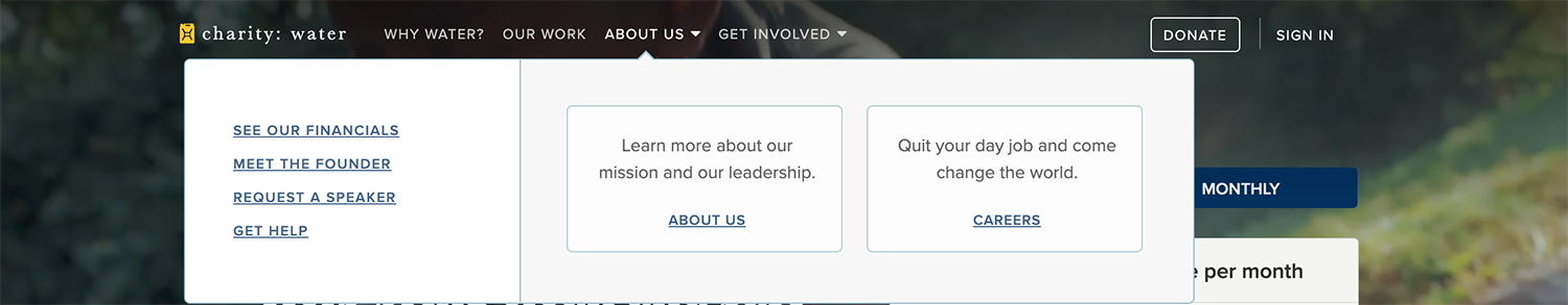
The most critical element of a site is the navigation menu. The navigation menu allows visitors to browse your site and discover and learn about your services. Therefore, it must be intuitive and straightforward.
There are a couple of different ways to move users through your site. The most common is the primary navigation displayed in a horizontal menu bar at the top of the website. You can also use dropdown menus in your primary navigation. It is important to note that these should be used with care. When used, make sure they are groupings of related content that would make sense to the user.
The sidebar is another popular way to guide users through your website. Sidebars are often found in the blog section of your website to list categories, recent posts, and other relevant information.
Why is intuitive navigation so important? Confusing navigation layouts will result in people leaving your site rather than trying to figure it out. So, instead of putting links to less important pages–that detract from your call to action or primary information–at the top of your site, place less important links or pieces of information at the bottom of a page in the footer.
Charity: Water’s website is a good example of intuitive navigation. Let’s take a look.
“It’s easy these days to be visually overloaded with images, to the point where our brains stop processing information when confronted with too many options,” explains Paolo Vidali, senior digital marketing strategist, at DragonSearch. To provide the best user experience, make certain pages do not have tons of graphics and competing calls to action that would distract the user from relevant information.
Another website design tip for streamlining pages is to keep paragraphs short. On most websites, a single paragraph should be no more than five to seven lines.
Create enough space between items on your page so the user has space to breathe and is more able to absorb all of the information presented to them. “White space” creates a more balanced layout, more clearly showing elemental effects and attracting users’ attention. When a website’s layout is poor, users will find it difficult to understand what the site is trying to convey.
It is easier for the user to read content on your website when there is enough spacing between words and segments. Improve user experience by using white space to guide the user so he can quickly find the information he seeks.
Using a consistent color palette can help your site project an elegant, clean, and modern appearance. Your color palette should have at most 1 – 2 primary colors and supporting secondary colors. Using color for headlines and graphics helps guide visitors to your most essential content.
It is also essential to use a color palette that complements your logo and is consistent with your other marketing materials.
“A picture tells a thousand words.” Good photographs draw the eye, provide an emotional connection to the written content, and explain complicated concepts. It is, therefore, vital to invest in professional photography.
You can do this in a couple of ways:
When choosing fonts, keep in mind that people will be looking at your website not just on a laptop but on mobile. Some fonts may read well on a desktop computer but not scale or render well on mobile devices. So, select a typeface that is easy to read across all devices.
Also, font sizes should be at least 16px. No one should need to read content on your site with a magnifying glass :).
Most website designs give a lot of attention to the home page. It is often assumed that all users enter the site through the home page. But in reality, there are many avenues through which users can enter your website. They can land on your services page, a blog post, or an events page. Therefore, you need to design your site so that no matter what page a visitor lands on, they will be given vital information and a clear path toward conversion.
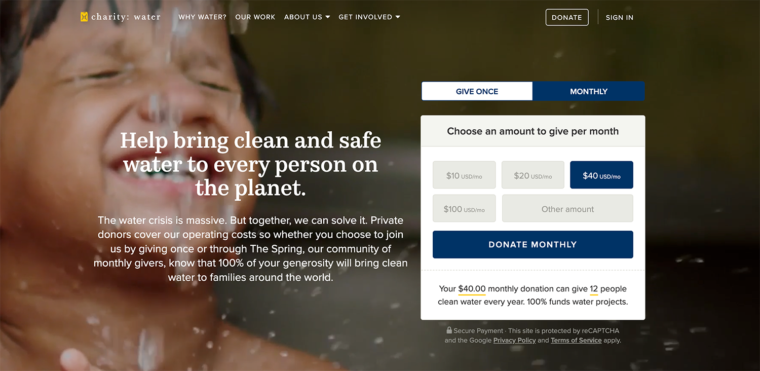
Another website design tip that you will often hear is that all relevant information should be above the fold. I don’t always agree with this statement because there is only so much you can add above the fold. What I do believe, however, is that your call to action complemented by persuasive text should be above the fold. “Above the fold” refers to the part of your site that users see without having to scroll.
Let’s take a look at how Charity Water uses its “above the fold” space. You can clearly see their calls to action accompanied by relevant and persuasive text to inspire users to give.
In the old days, developers would build a website for each device. There would be a site for desktop computers and a different site for mobile. Instead of developing a website for different devices, a responsive site is designed to adapt to the browser size, making for a better user experience. A better user experience typically translates into more time spent on your site and higher conversion rates.
Buttons can be the most forgotten part of a website. Whether it’s a button at the end of a web form or a donate button, they should be so visually appealing that visitors can’t help themselves. They just have to click it. Also, buttons should look like buttons. When a visitor hovers over a button on your website, there should be some indication that this item is clickable. It should change color, gradient, opacity, or font treatment. The same goes for any clickable links on your site.
Allow yourself to be more creative with the text on buttons. Instead of “send” or “submit” on a newsletter subscription form, you can say, “I want in” or “sign me up.”
It is always best practice to test your design with users. Whether you are trying different placements for a call to action or even testing different shades of color, website changes can significantly impact your bottom line. A user experience manager at Bing once remarked that Microsoft generated an additional $80 million in annual revenue just by testing and implementing a specific shade of blue!
I hope these 12 website design tips help you create your new website or improve your current one. Do you have questions or thoughts you would like to share with us? Drop a note below in the comments section.
Check out one of our fully customizable website templates designed to stand out and convert your dream clients. All templates start at $147.